Challenge
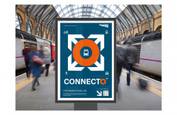
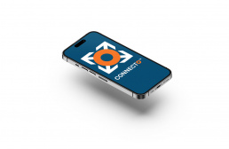
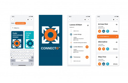
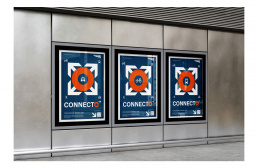
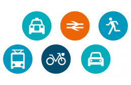
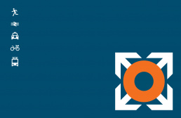
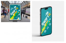
I was asked to create some quick concepts for a Network Rail app that was a journey planner to leading sporting events. The brief was to create a logo and some eye-catching imagery that could be used as posters in major stations. The user would use a QR code to launch journey information with the best travel connections. The project would be extended to an app if it proved popular. The new merger of Great British Rail had to be considered.
Solution
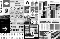
This was a great opportunity to explore British Rail’s rich visual history particularly the hey day in the 60s. I took inspiration from the work of Jock Kinneir and Margaret Calvert who developed sigange and typography for both road and rail in the 6Os that is still used today. The style has a timeless quality due to its vector simplicity. I was provided the updated Rail alphabet font by NR and proceeded to develop several concepts. We were asked to develop a list of names to make the application more eye catching. We polled internally.
Result
The designs sadly were never presented as the project was shelved halfway through. It was decided to be brought back inhouse by Network Rail. It was a disappointing decision after so much energy and research. It hasn’t lowered my admiration for Calvert and Kinneir however.