Problem
Impact, a global leader in experiential learning, had an outdated brand that hadn’t changed in over a decade. Its visual identity—rooted in imagery of the Lake District—failed to reflect its evolution into leadership development and digital learning.
Challenge
Modernize the brand to support a shift toward blended (digital and face-to-face) learning. Create a bold, contemporary visual language usable across all global offices, while navigating complex internal politics.
Solution
In 2020, the rebrand was approved. I joined after a year of stalled progress due to internal disagreements. With the logo and Gotham font already approved, my brief was to push the brand forward with a bold, modern aesthetic.
Result
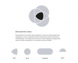
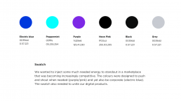
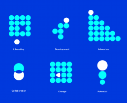
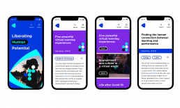
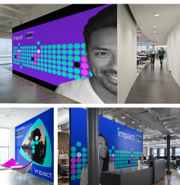
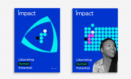
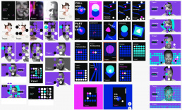
We developed a striking visual system using geometric forms to clarify Impact’s methodologies and unify its digital offerings. While internal politics ultimately shelved the rollout, the work positioned Impact as a future-ready brand.