I enjoy working on private freelance projects of all sizes. It allows me to continue to explore my creativity which working for larger companies doesn’t always allow.
Problem
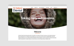
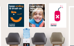
A local dental practice was acquired by it’s three principal dental surgeons. I was asked to rebrand the practice. The brief was to make it welcoming and modern.
Solution
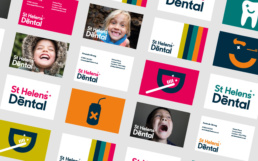
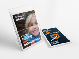
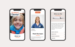
I created multiple mood boards of swatches and photography to develop a modern look and feel. Several logos using Humanist sans-serif typefaces were explored. The final design used the font Sharp sans. It was combined with dental icons to create a fresh, fun and warm monogram. A clean and bright swatch was developed. I wanted the swatch to be flexible with all aspects of the brand including fonts, icons and photography. The result is fresh, clean and fun.
ClientSt Helens DentalYear2020ProjectBranding, UI, Art Direction