Problem
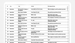
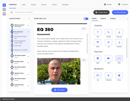
The Content Creator interface was the second part of the Air 2.0 development. This piece of software allowed our team to create and manage Air journeys for our clients. The original interface was designed and built very quickly to meet our original hard deadline in 2018 of 12 months. We had a blue-chip client waiting to use it. Though functional it could be difficult to use. Feedback sessions told us it needed to be simpler/quicker and have new core functions.
Solution
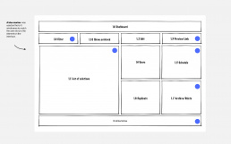
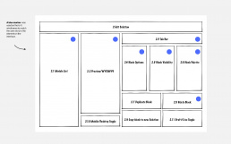
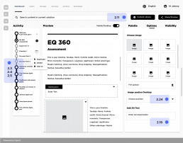
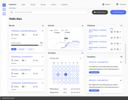
After feedback sessions, we decided to develop a dashboard landing page. This gave the user an overview of all the core functions and showed all the live solutions currently in progress. The idea was to make everything visible and easier to locate. The project was still in development when I left the company. user stories were created for all the core users of the interface. This included consultants, project managers and facilitators.
Key improvements:
– Simpler and cleaner UI
– Dashboard homepage (Solutions, calander, stats)
– Ability duplicate solutions
– An archive area
– Solution tracking
– Link to future software products